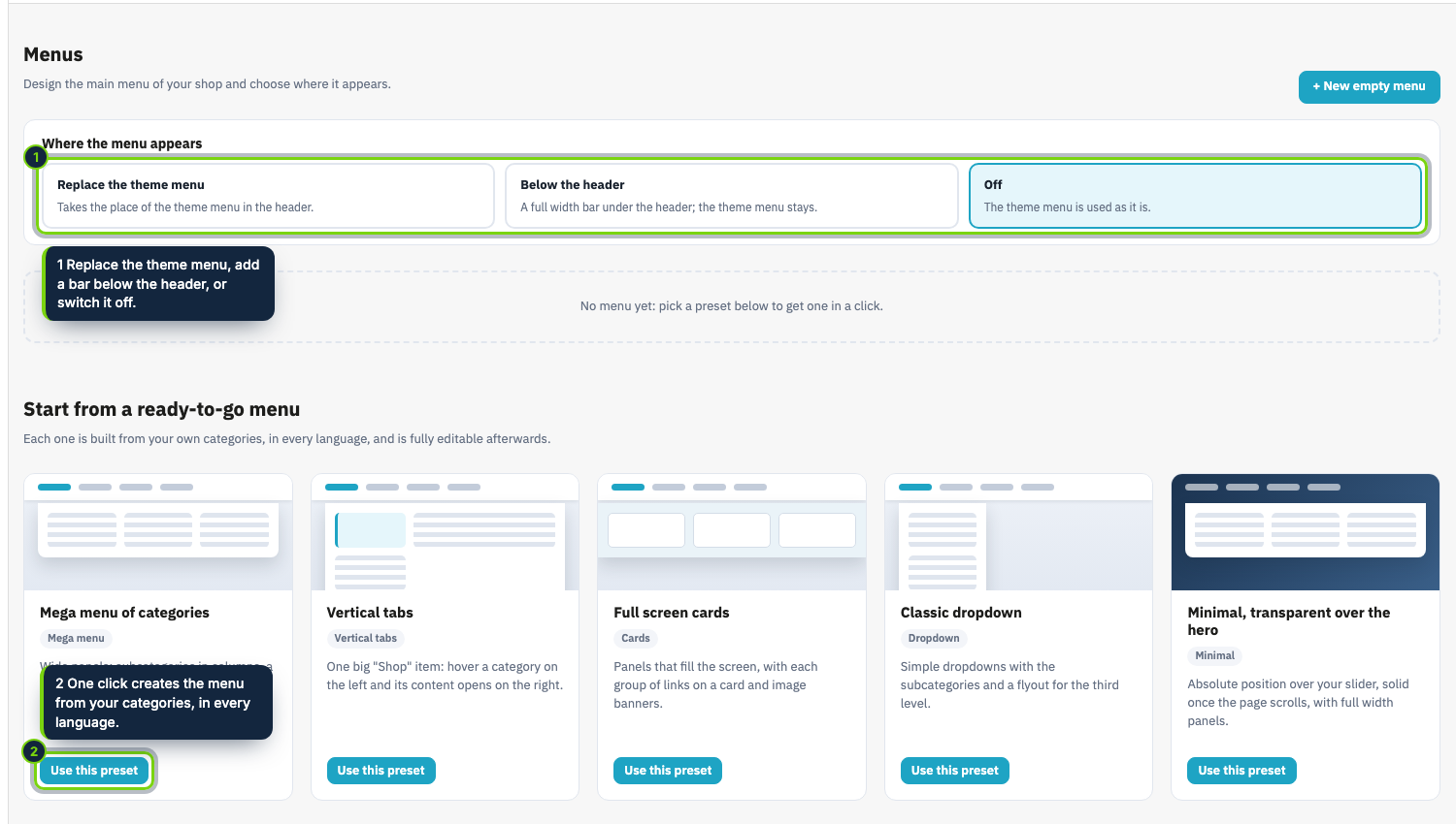
Design the main menu of your shop without touching code. Start from one of five presets, built from your own
categories in every language, then change anything.
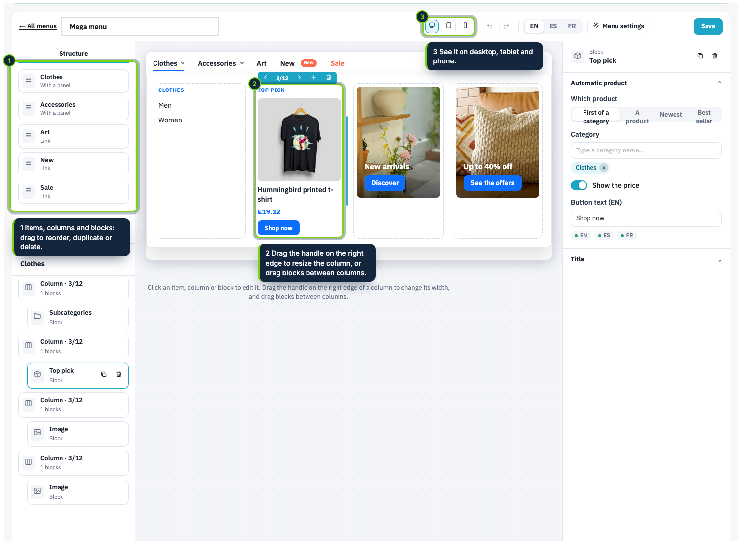
Panels made of columns. Add columns to an item, drag the edge of a column to resize it and drag blocks
between columns. Blocks: links (with a flyout submenu), the subcategories of a category, a product, a banner
image with caption and button, text, and CMS pages. Give a panel a background image or color.
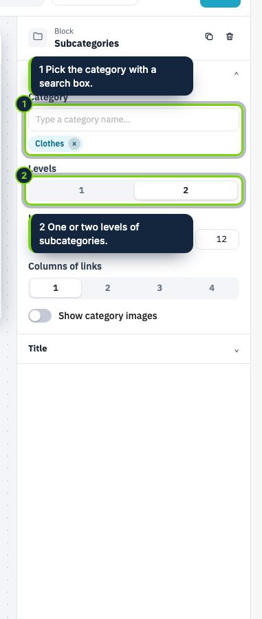
Actions that follow the catalog. A subcategories block lists the categories under any category, one or two
levels deep, with their images if you want. A product block shows a chosen product, the first of a category,
the newest or the best seller, with its price and a button. When the catalog changes, the menu does.
Where and how it opens. Panels open under the item, contained, full width or full screen, on hover (with a
small delay) or on click. The bar can be normal, sticky, fixed, or over the page and transparent until it
scrolls. Colors, fonts, spacing, corners, shadow and animation are all settings.
Mobile. Below the breakpoint you choose, the menu becomes a burger with a left drawer, a right drawer or a
full screen menu, with an accordion for the panels.
Light and good for SEO. A real nav with real links in the HTML (panels are not injected by script), hover
and focus that work with CSS alone, no headings inside the navigation, lazy images with fixed proportions, and
about 4 KB of CSS and 2 KB of JavaScript gzipped, loaded only where the menu is.
With the Theme Editor. Mega Menu Pro comes with the Aura theme. Its settings appear in the Studio with a live preview, and the menu, with its banners and images, travels with the export and import of the whole look of a shop.